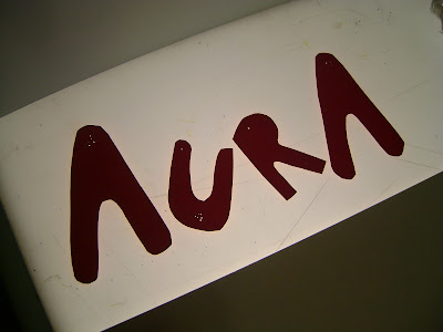
After much trial and error the orange glow finally establishes itself-really
nice effect actually.
This outcome was given to me by my tutor. The idea was to
get some card that was brightly coloured on both sides, cut
the letters out and pin them against a white wall. In turn
the colour from the card will reflect onto the wall and
create a glow around the letters.
Exactly what i wanted-the white ambience under the letters, an aura.
Nice shadowing thanks to the effective but unbearably hot studio light.
My favourite of the the final outcomes, i love the reflections of the letters
on the lightbox-looks like they are on water.
Heres my 3d typography final outcomes. This was my first brief in visual
communication territory and i really enjoyed it.. The brief was to
investigate fonts and how they can represent a certain word.
You then had t o pick a word from that list
and create it in 3d.


